Building a Design System with Developers: Page Variables
It's been nine years since Figma first entered the design market. During that time, there have been many changes in the design ecosystem, and Google's Material Design System, first released in 2014, can now be easily implemented within Figma.
In 2023, the introduction of the Page Variables feature in Figma marked a major turning point in how design systems are built. It enabled more detailed design specifications and, crucially, significantly reduced discrepancies between designers and developers through a developer-friendly structure. This article will explore how to construct a design system with development in mind, focusing on its core component: Page Variables.
1. Why Use Page Variables?
Many designers still work with Local Styles. While Local Styles are generally adequate for development, they have several limitations when it comes to flexibility. For example, what if you want to use an 18px font with both Bold and Semibold weights? In Local Styles, you have to either register these as two separate styles or break from the style and apply overrides manually. However, Page Variables manage properties like size and weight as independent variables, allowing for much more flexible combinations within a single text style. This is identical to how developers use CSS variables or design tokens.
Furthermore, most UIs today are responsive. It's now standard practice to use different font sizes for PC and Mobile. Local Styles cannot handle this within a single style. With Page Variables, however, you can use a single name to map to different values depending on the device.
2. Basic Concepts of Page Variables
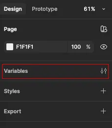
When nothing on the page is selected, the right-side panel appears as shown in the image above. You can configure Page Variables by clicking on the "Variables" menu here.
Figma's Page Variables are very similar to the CSS variables that developers use. A "variable" is an agreed-upon value that holds the same meaning wherever it's used. For instance, if you define a variable named blue-500 with the value #0000ff, using blue-500 anywhere will apply the color #0000ff. Based on this concept, you can define the following items as variables:
Color
Font family, font size, font weight
Line height
Radius
Padding, spacing
Text
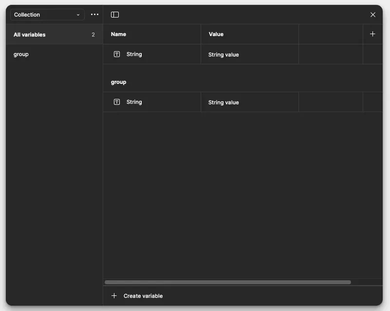
Page Variables are organized into units called 'Collections,' which act as folders for your variables. Within a Collection, you can combine group, name, value, and mode to set up values for various scenarios.
When developers register variables, they mostly use kebab-case and lowercase letters. Therefore, it's a good practice to use kebab-case and lowercase for naming your Variables as well. Also, developers often represent numbers with leading zeros (e.g., "01"). This accommodates numbers up to "99," so it's best to follow the same convention.
3. Defining the Color System
First, we'll define the color system. There are two main naming conventions for color systems: Primitive and Semantic. I personally start by defining Primitive colors. This is because the Semantic approach requires assigning names based on the variable's role and meaning, which can make establishing naming rules relatively complex depending on the situation. Thus, I use Primitive as the base and only apply Semantic naming to a few simple cases. First, create a Collection, which serves as the folder, and name it "Primitive Color".
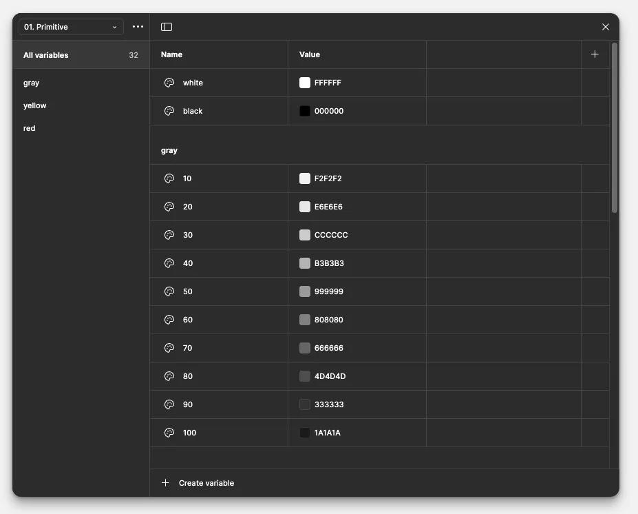
The values above are the Primitive Color values applied to my blog. Typically, a 100-900 scale is used, but for this blog, I used a 10-100 scale as I didn't expect to add finer-grained steps. You can create groups in Variables by using a /. For example, naming a variable "gray/10" will create a group named "gray". The variables defined in the image above are applied in development as follows.
SCSS
1
2
3
4
5
6
7
8
9
10
11
12
13
14
15
:root{
    --color-white: #ffffff;
    --color-block: #000000;
    --color-gray-10: #f2f2f2;
    --color-gray-20: #e6e6e6;
    --color-gray-30: #cccccc;
    --color-gray-40: #b3b3b3;
    --color-gray-50: #999999;
    --color-gray-60: #808080;
    --color-gray-70: #666666;
    --color-gray-80: #4d4d4d;
    --color-gray-90: #333333;
    --color-gray-100: #1a1a1a;
}
4. Defining the Font System
When defining font-related Variables, you need to use two Collections. This is because font sizes require the use of modes. Let's look at font size first.
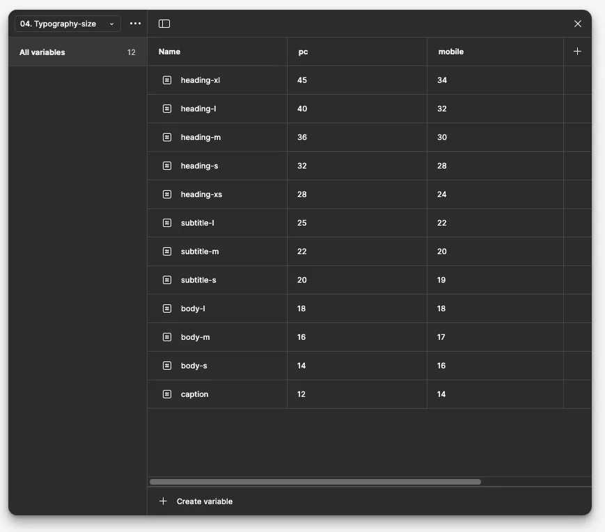
I configured this based on the Google Material Design Guide. Since mobile screens are smaller than PC screens, I reduced the sizes for the subtitle and heading families. On the other hand, for body and caption text, they tend to render quite small on PC, so I increased their sizes. After applying these settings, when you use the variables in a frame, you can select a mode for each frame.
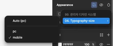
This feature allows you to set a mode on a per-frame basis without changing the Variables Mode of the entire page. Using this, you can set the PC Mode for frames designed for PC screens and the Mobile Mode for frames designed for mobile screens.
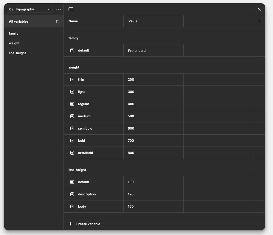
These are the font family, weight, and line-height. I am using a separate variable for the font family. For this simple blog design, I used only one font, but for projects with a landing page, an accent font is often used. In such cases, I add and use another font. For weight, I've entered the standard values. You should be mindful that different fonts support different weights.
I am using % values for line-height, but unfortunately, at the time of this writing, Page Variables do not yet support percentage units. Nevertheless, the reason I've defined it here is so I don't forget this standard during work.
5. Defining Other Properties
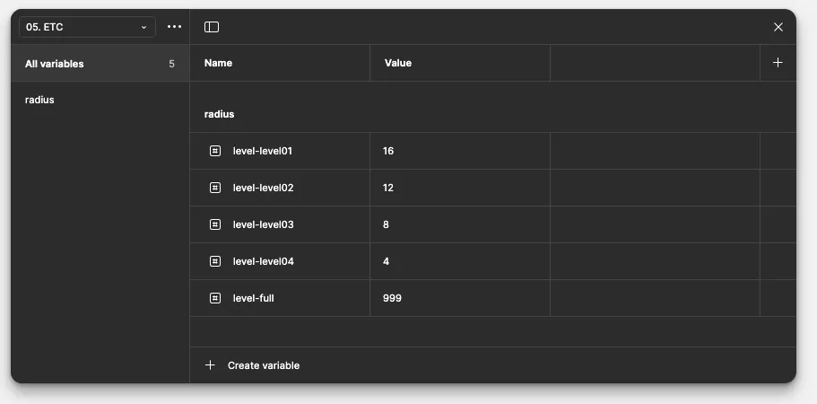
I have recorded other values I use, such as Radius, Padding, and Gap, in a Collection named "ETC". For the blog, I have only defined different levels for Radius.
So far, we have registered several Variables. Now, one important setting remains that will make our work more efficient. By default, all variables can be selected for any property where they can be used. However, you wouldn't want to apply a font size variable to a property like spacing or width. This is where 'Scoping' comes in.
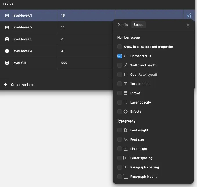
Scope is a feature that determines where a variable can be used. In this case, I've set the Radius values to be usable only for "Corner radius". This prevents them from getting mixed up with other values, making your workflow cleaner.
In this article, we've explored how to define and organize the foundational units of a design system—such as color, typography, and spacing—using Figma's Page Variables. A robustly designed variable system like this reduces communication overhead between designers and developers and becomes a crucial foundation for ensuring consistency across all future work.
In the next article, we will cover how to apply the variables we created today to actual UI, and how to build reusable 'Components.'

Lovefield
Web Front-End developer
하고싶은게 많고, 나만의 서비스를 만들고 싶은 변태스러운 개발자입니다.

Using Prometheus
prometheus 를 사용하여 메트릭 정보 수집
Server

Easy-to-Miss Details When Integrating Sentry with Spring Boot
sentry에 비동기 작업과 스케줄러에서 발생하는 오류 보고하는 방법
Spring Boot